A picture is worth a thousand words.
The history of Christian iconography is rich. The use of symbols to represent theological ideas is an art form all its own, and a part of our tradition that extends to the earliest days of Christianity when symbols were often used to assist in “translating” bible stories and to teach theology before literacy was widespread. Our churches are laden with symbols and artwork that tell the history of our salvation; that underscore important themes of eternal life, abundance, God’s providence and our redemption; and that enhance our devotional experience in their beauty and craftsmanship.
Symbols, pictures, and iconography tells the story of who we are and offer a visual means to make sense of our vibrant tradition.
The most recognized symbol of the Christian tradition is, of course, the cross. In it we remember the death of Jesus by which we have received our eternal salvation. Episcopalians/Anglicans generally feature an “empty cross” in their churches (instead of a crucifix) which underscores our emphasis on the “outcome” of Christ’s death rather than his passion.

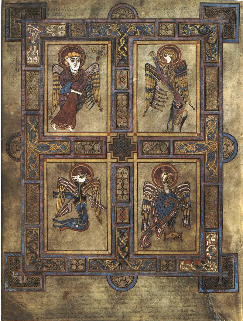
Many of our saints have symbols ascribed to them, including the 4 Evangelists:
Matthew is ascribed the Winged Man; Mark, a Winged Lion; Luke, an ox; and John, an Eagle. The origin of these animals as symbols is drawn from both Ezekiel (Ch. 1) and the Book of Revelation (Ch. 4). Here they are depicted in the Book of Kells, a great illuminated manuscript from the Celtic tradition around the year 800.
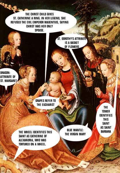
As the pantheon of saints grew in the church, each one was given a symbol, for easy “decoding” in artistic renditions. This comic illustrates the usefulness of symbols in Christian art.
Here’s some information
on a few other common Christian symbols and iconography:
The Virgin Mary is often depicted in Christian art as wearing blue and bearing a lily, the flower that, in medieval times, was found to best symbolize the purity of Mary. By the 14th century, it was common to find the lily in Annunciation paintings and illuminations. In many scenes of the Annunciation painted during the Renaissance, the Archangel Gabriel holds a lily.
![]()
The color that Mary wears has been linked to the color of an “empress” (www.quora.com) from the time of the Byzantine Empire in late Antiquity. It is also the color of lapis lazuli, a precious blue stone worth more than gold, and so it was an expression of devotion and glorification to portray Mary in blue.
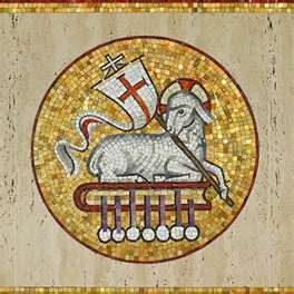
Jesus is often referred to as the Lamb of God. Coming from the prophesy in Isaiah where we are promised a Messiah who would be led, “like a lamb to the slaughter” (Is. 53:7) and later, in the Gospel of John where John the Baptist announces Jesus’ arrival as the “Lamb of God,” (1: 29) and finally in the Book of Revelation where the lamb appears and we read “worthy is the lamb that was slain…” (Rev 5:12), the lamb figure is a common figure for Christ.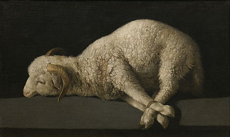
As a visual motif,since the Middle Ages the lamb has been most often represented with a halo and a foreleg “holding” a pennant with a red cross on a white ground, symbolizing the triumph of the resurrection.
And, finally, the fish.

The fish is a well-recognized symbol that is also known as an Ichthys (coming from the ancient Greek word for fish). IXИYУ is an acronym coming from the first letter of words that mean “Jesus Christ God’s Son is Savior.”
Those words are
- I– Iota or Iesous – Greek for Jesus
- X – Chi or Christos – Greek for Christ
- И – Theta or Theou – Greek for God
- Y – Upsilon or Yios/Huios – Greek for Son
- У – Sigma or Soter – Greek for Savior
What’s New: Today in the Diocese of Central Pennsylvania
![]()
![]()
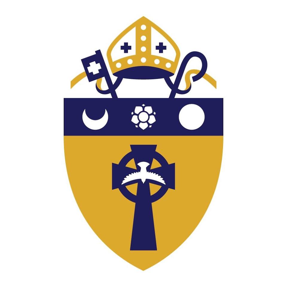
In our diocese, we have recently chosen to “re-fresh” the shield and symbol of the Diocese of Central Pennsylvania. This refreshed symbol is part of a larger effort to bring all of our diocesan communications into sync by offering one “look” for the website, print correspondence and digital communication.
Designed by Jason Smith of Fathom, Inc. in Mechanicsburg, the re-freshed look of the diocesan shield and logo include the traditional symbols, colors and motto of the diocese, but in a cleaner and brighter presentation and with a feeling of openness and movement.
The symbols in the logo and shield are significant to the life our our diocese. From top to bottom:
The miter at the top symbolizes the episcopal identity of our church along with keys and a crozier, symbols for the Church and the Bishop.
The circle stands for the “plate” of William Penn, founder of Pennsylvania, and the crescent is the symbol for John Harris, founder of Harrisburg. In the center, there is a rose. The original symbolism of the rose was intended to represent our Anglican heritage, as it is the Anglican “advent” rose, though sometimes this rose is thought to represent the cities of Lancaster and York (as in the “War of the Roses.”) In the lower section of the shield is a Celtic Cross indicating another tie to our Anglican heritage, and a dove representing the presence of the Holy Spirit. The motto, Spiritu Dum Spiro Spero, means – “In the Spirit, while I breathe I hope. “
So why this update now?
Since my arrival in our diocese, I have been talking about a “shifting religious landscape” and my desire for us to listen closely to God’s call to us as we discern how God wants our church to be in the future. This requires good and long listening, the spirit of creativity to imagine new ways of being Church, and a willingness to shift our shape, slightly, in accordance with God’s will. It is an act of faithfulness.
A new “look” for our diocese that preserves the best of what we have had, in years past, and allows for a shifting of shape is an icon all its own, for our movement forward, in faith.
I look forward to the new, uniform look that we can present as a diocese that is smart and fresh- and I look forward even more to continuing our work together as God’s faithful people, shifting, changing and being responsive to the Holy Spirit as we serve God’s mission.
It may look like a slightly altered logo.
It means so much more.
To God be the glory.
We were blessed to have a Lenten Study on Christian Iconography at Holy Trinity Episcopal Church, Hollidaysburg, hosted by the Rev. Jeanne Jacobson.
Nanette- what a gift! When I was at Yale I took a class in Iconography and Christian art. Glad you all got to do some good work in this area. I imagine you and John had plenty to contribute!